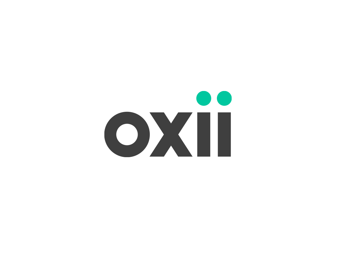
OXii Branding
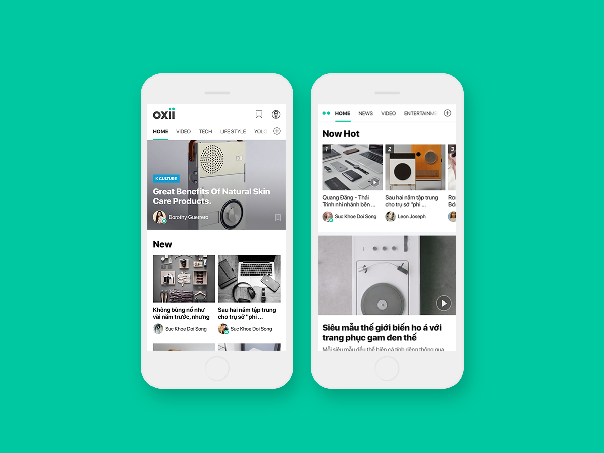
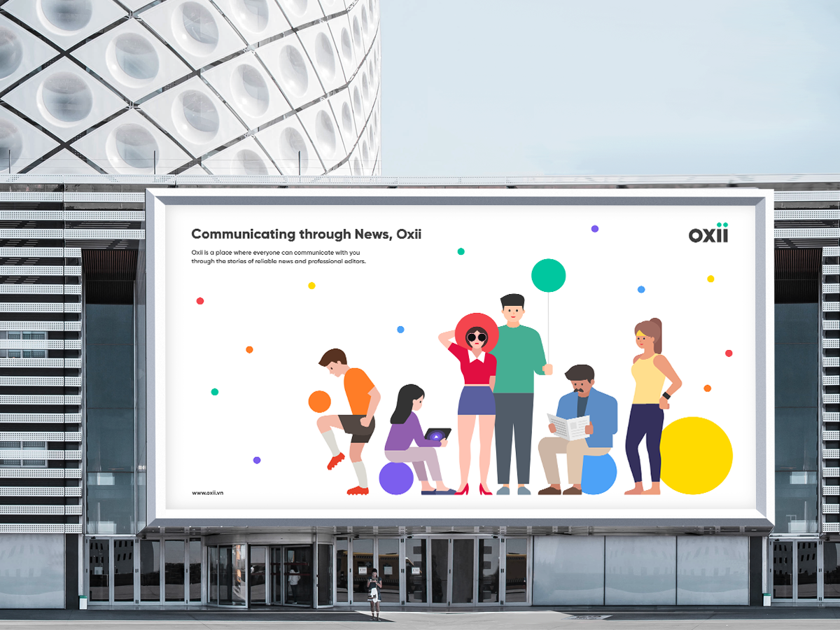
OXii is a Vietnamese portal site that opened in 2018 and serves communities, news, and videos targeting all ages.
OXii is recognized as an essential element for humans, such as OXYGEN, a word that has a similar pronunciation, and aims for a platform that is flexibly evolving. Therefore, OXii has set intimacy and neutrality as key values.
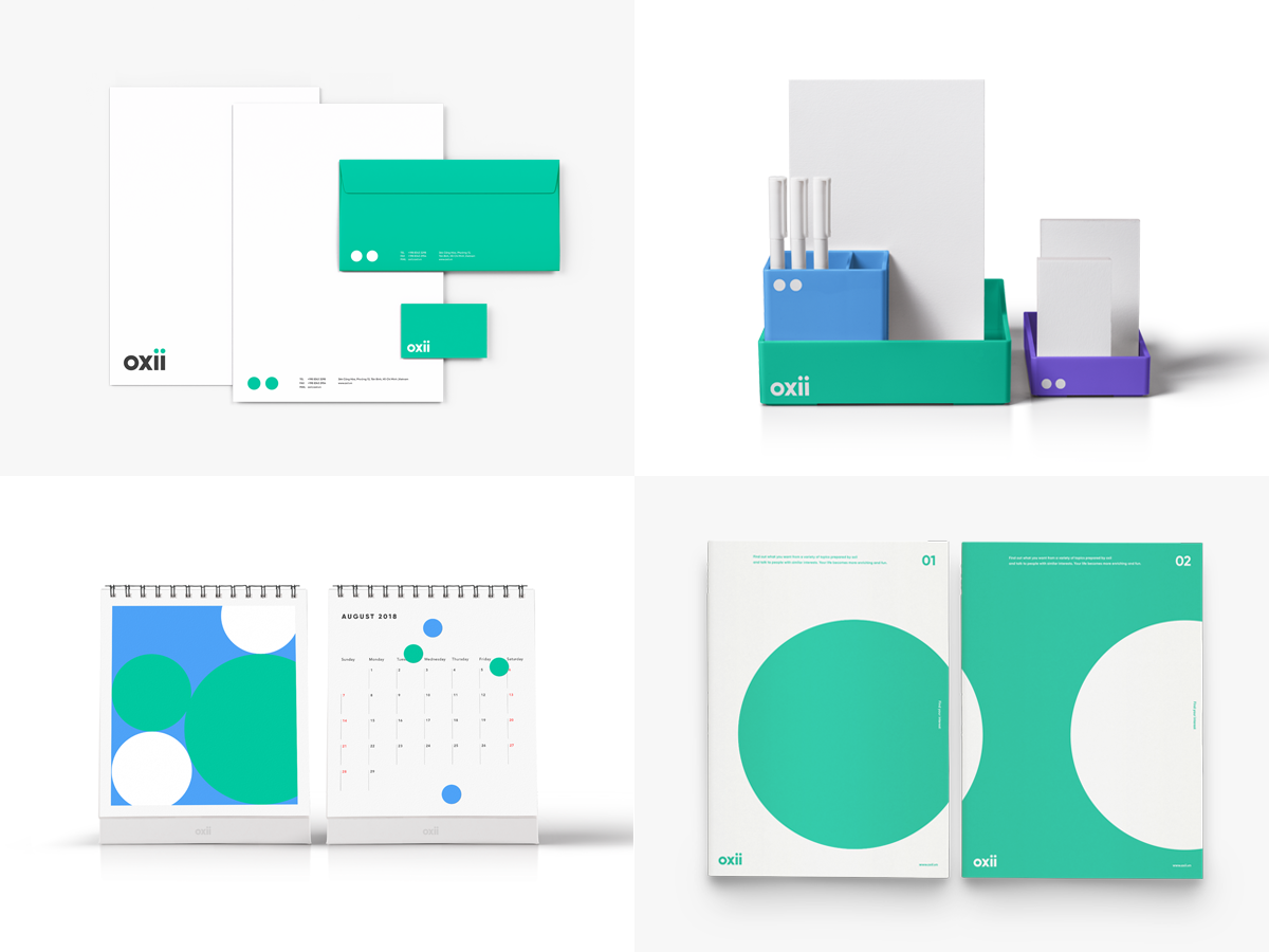
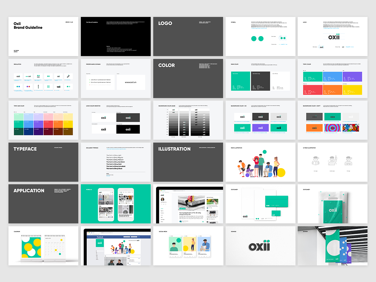
OXii aimed for a conceptual design direction rather than an intuitive expression in consideration of service scalability. The two dots included in OXii's logo are symbols representing OXii services. Two dots are available in different colors, which means variable categories of portal services. Also, two dot symbols mean the enjoyment of the public.
With its formative and casual brand Asset, OXii's users experience positive enjoyment.
Lead, Design Direction: Yang Seungdoc
Design: Ryu Gayoun